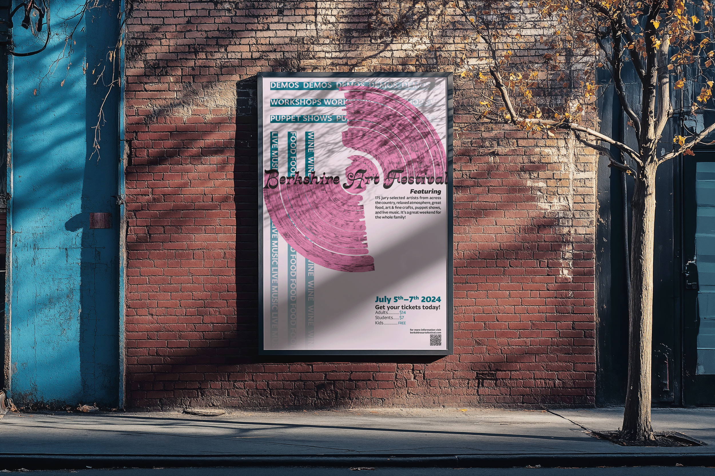

Typography Poster, Festival
Process Sketches


Type Manipulation
After experimenting in illustrator with 3-D and materials I discovered how to create this brushstroke effect.
Before

After
Design Statement
In my initial design of a poster for the Berkshire Art Festival I began by creating iterations based on the tones: warm, playful, dreamy, elegant and modern. However, the outcome was overcrowded with colors and text elements and lacked cohesion. In the redesign I aimed to preserve the playful, creative spirit but refined the color palette to be more subdued, allowing the typography to take center stage.
For the heading, I chose Crayonette DJR for its flowing curves, elaborate serifs, and subtle contrasts that evoke a sense of elegance and whimsy. I leaned into a warm and welcoming tone through the body text and sub-header typeface, Fagun, the sans-serif maintains legibility and readability with a playful flair. I explored how typography alone can communicate the energy and creativity of an art-focused event. Using Adobe Illustrator’s 3D extrude tool, I manipulated the title to create a shape that resembles paint swipes or brushstrokes, creating a sense of movement that evokes the physicality and motion of traditional art-making techniques. I emphasized contrast in font, scale, and spacing to establish a clear visual hierarchy within the supporting text elements. I incorporated the events as repeated headlines to create texture and visual interest in the background while placing emphasis on the underlying grid.